Project Description
Redesigned a hypothetical visual brand system if Rome hosted the 2024 Summer Games. Applied from logo to print, digital media and environmental graphic design for this large scale city event. Rome’s last two logos as a bidding candidate do not look like they have much heart. I believe the concept can be more clever as a unique representation of the Roman heritage. There is tremendous potential to showcase Rome’s history, art, and culture in their re-branding of the Games. As an enthusiastic Olympics fan having watched it since childhood, I was naturally invested in this project.
The Olympics are one of the greatest branding case studies of all time. The brand represents something that goes way beyond athletic competition. It’s the intangible “spirit of the games” that makes it riveting for the audience, and desirable for branding. Every Olympic Games is filled with real-life stories of triumph and tragedy. Every night for two weeks there are new characters, new story lines, new scenic backdrops, new drama. Its heroes and underdogs, great feats of strength and stamina juxtaposed with delicate dance moves and tears of joy.

Left: Rome’s official logo as host of the 1960 Summer Games; Middle: Rome’s bidding logo for the 2020 Summer Games. They later withdrew; Right: Rome’s bidding logo for the 2024 Summer Games. They withdrew a second time.
LOGO Re-Design
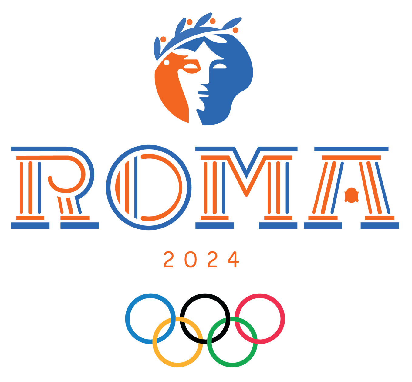
Rome is called the Eternal City because ancient Romans believed that no matter what happened to the world, or how many empires rose or fell, Rome would go on forever. With that idea in mind during the design process, this logo makes a lasting impact. The logo mark represents a female Roman statue wearing an olive wreath, an icon of the golden age of Ancient Roman art history. The logo type visually represents columns of a Roman temple; the counter of the ‘R’ represents an Ionic column’s capital; the crossbar of the ‘A’ represents an ‘egg and dart’, which is a carved ornamental design in relief consisting of an egg-shaped figure alternating with an elongated arrowhead figure. The logo type is a custom design, geometrically constructed from scratch. The brand colors of orange and blue represent the Mediterranean sun and ocean. The warm orange Mediterranean light shines from the left side, while the cool shadows of the ocean are cast on the right side.
Brand Design: Primary and secondary color palette on Logo and Wordmark
The primary colors of orange and blue represent the Mediterranean sun and ocean. The warm orange Mediterranean light shines from the left side, while the cool shadows of the ocean are cast on the right side. The secondary colors of desaturated yellow-orange, orange, and olive green represent the colors of residential homes in Roman neighborhoods.


Brand narrative: Roma 2024 Look book
ROMA 2024: A History, Vision, and Future
Each ticket holder gets a copy of a look book published by the Roma 2024 Olympic Organizing Committee. It showcases a brief history of Rome, it’s vision and goals for the 2024 Games, a venue map, transportation options, the beauty and vast culture the city offers, a flashback at previously hosting the 1960 Games, and breakout star athletes to look out for.
Typography chosen is Bourton and Futura PT. This type combination balances out the Italian, athletic, and modern themes of the event.
Photos By: Getty Images, AP News, NBCOlympics.com, various travel blogs.


BRANd Implementation: Promotional Banners
Three systems of banners were designed to promote the Roma Games around Italy. These bright colors and graphics truly celebrate the Italian culture and history. They are an impressive sight to see around Italy and Rome.
System 1: A celebration of the city of Rome and the Olympic values. Used as a promotional kick-off months before the Olympics arrive in Rome to excite Italian citizens.
System 2: The main set of banners featuring the city’s official Olympic logo in the brand’s primary colors. Displayed at main venues such as the Stadio Olympico (Olympic Stadium).
System 3: The vertical logo with tiles breaking out. Colors used are the brand’s primary and secondary colors as well as their tints and tones.


BRANd Implementation: Mobile Digital Ticketing
The UI and UX process of ordering an event ticket on your phone. There are five splash page designs that rotate before the general screen appears.


BRANd Implementation: Co-Branding for Medal Podium Design; Horizontal Banners for Track and Field Stadium; and Runner’s Bib Design
This front view of the medal podium and horizontal banners are designed for the media to show on camera for television and in still photos. The primary medal podium design shows brand continuity featuring the Olympic rings, tile graphics forming a triangular pediment of a Roman temple. This triangular shape points up to the first place athlete. The second version of the podium design shows co-branding of OMEGA® and the Olympic rings. OMEGA® is the official timekeeper of the Olympic Games.
The lower horizontal banners wrap around the track, as the brand colors alternate from yellow-orange to orange to blue to green with the tiles blending in between each color’s transition. The upper horizontal banners wrap around the audience stands and are made of LED lights, showcasing the logo and brand colors. These bright colors and graphics truly celebrate the Italian culture and history and are an impressive sight to see around the stadium.
The runner’s bib graphics at the top showcases a strip of the brand’s primary and secondary colors, and tile graphics breaking off at the bottom. This shows brand continuity from the outdoor banner designs.


BRANd Implementation: Applications
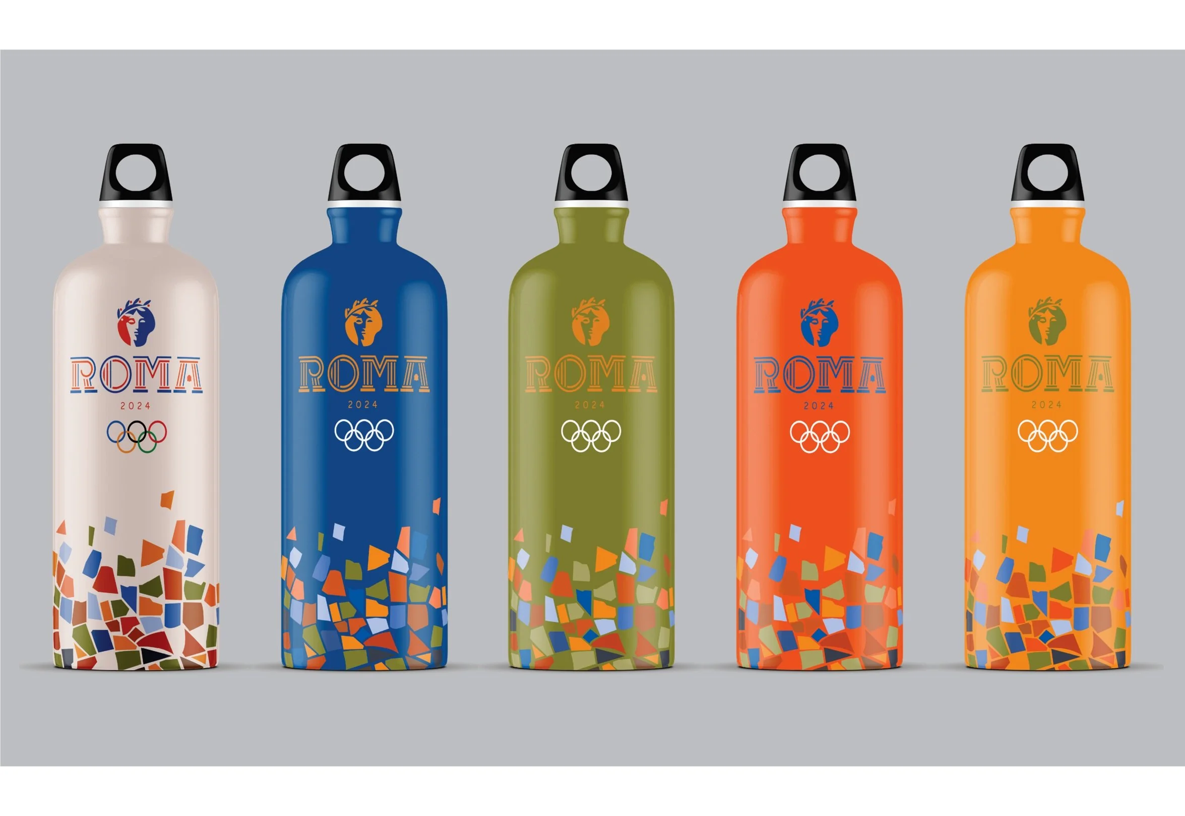
Sport water bottles and enamel pins are just a few of the many Olympic memorabilia one can purchase at the gift shop. It is Olympic tradition for athletes and fans to trade pins and build a collection!